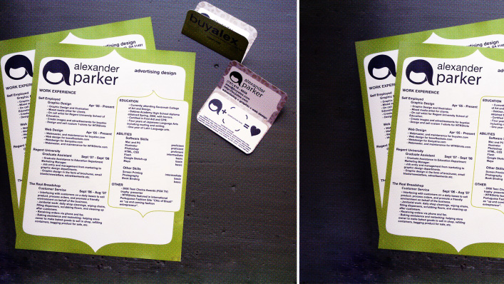
"The case for and against turning your resume into an infographic image"
In a competitive job market it’s tempting to want to make yourself stand out.
And since we are such a visually driven culture (studies show that you can convey more information faster with pictures than you can with words), it’s not surprising that some job seekers are considering turning their resumes into infographics.
These visualizations of data are everywhere, from the best places in the world to start a business to the sleep schedules of some of history’s greatest minds.
And some believe that the data on your resume is the next logical step. Matt Cooper, CEO of Visual.ly, an online visual content marketplace, argues that it’s getting more difficult to fit an entire career into a simple chronological list.
“The world has gotten so competitive that employers are less likely to take a risk on a new employee without doing a thorough check of their job performance. And that means data–lots of it,” he says.
But before you turn everything on your resume into a bar graph and pie chart, there are a few things to consider:-- read the article

No comments:
Post a Comment
Note: Only a member of this blog may post a comment.