

I guess I really don't have a concrete idea like most of the other people on here, but I have somewhat of an idea of what I want to do. I am a big fan of the old Star Wars and Indiana Jones movie posters, which have tons of different layers, so I was thinking I would base my movie poster somewhat off of those. It usually has the protagonist in the middle of the frame, while showing the other supporting character and the antagonist is usually pretty large in the background taking up quite a bit of space.
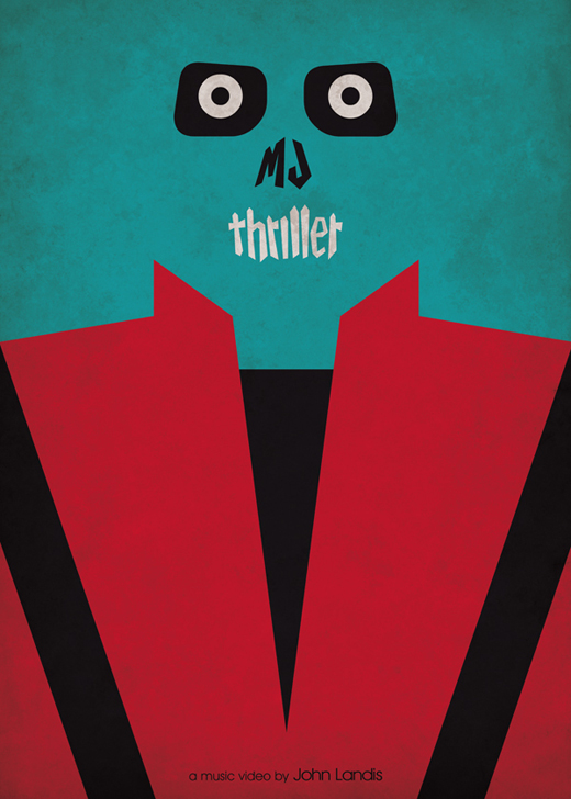
And if I don't end up going with that idea, I am a HUGE fan of minimalist movie posters. There's just something about them that I absolutely love. Those usually have a main color, usually bright, taking up almost the entire background and then there's just one or a few images from the movie that describe it. You usually have to have seen the movie to understand it, but they just look so crisp and clean. Here are a few:
These Star Wars one are a pretty good detailed example of some but there are also ones that are almost 70s inspired? I guess you could say....


 These are just a few different examples of Minimalist movie posters that I think are all pretty interesting....
i think these are great. i already wrote to you about them. texture counts as a layer. and they are really great examples of masking..
ReplyDelete